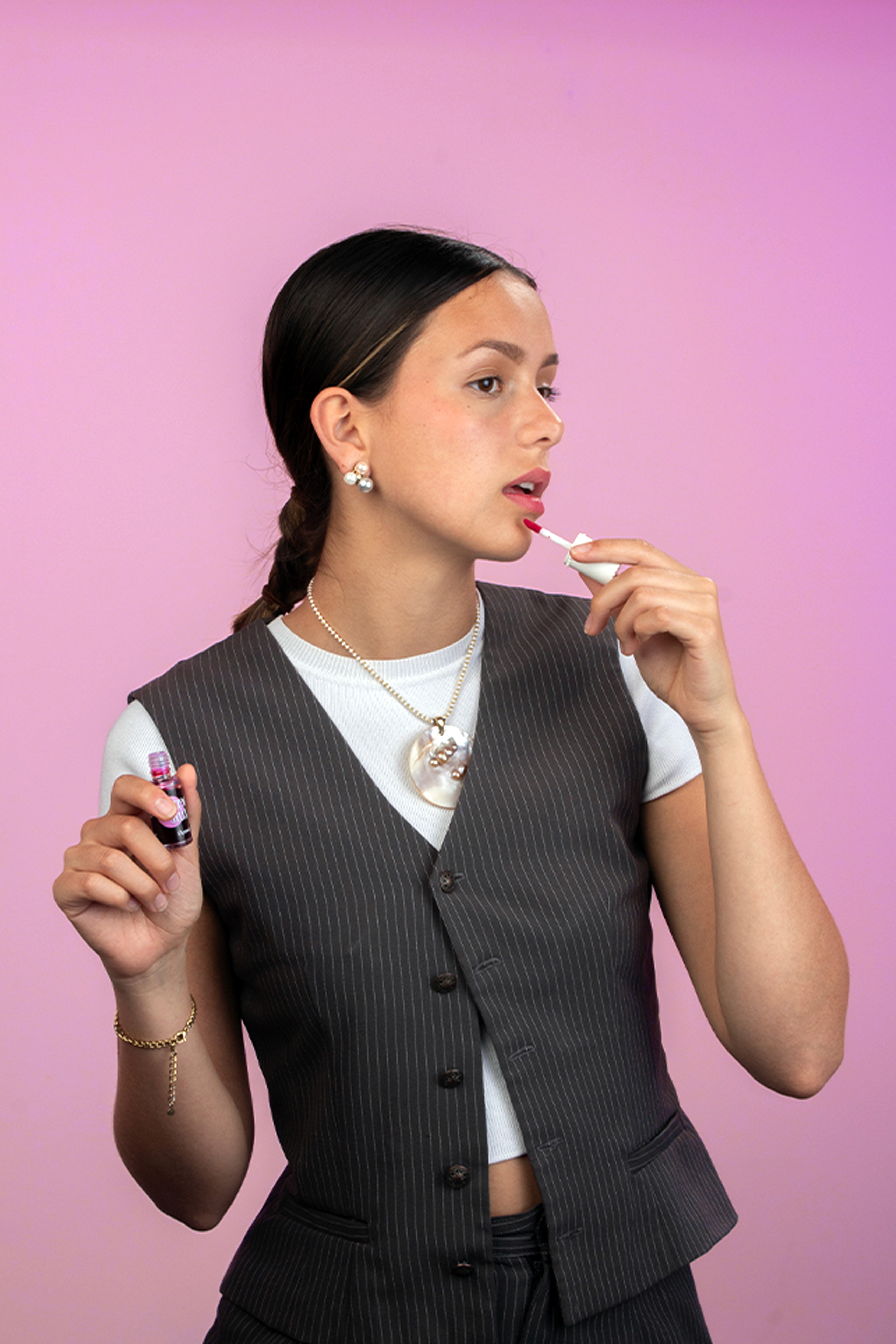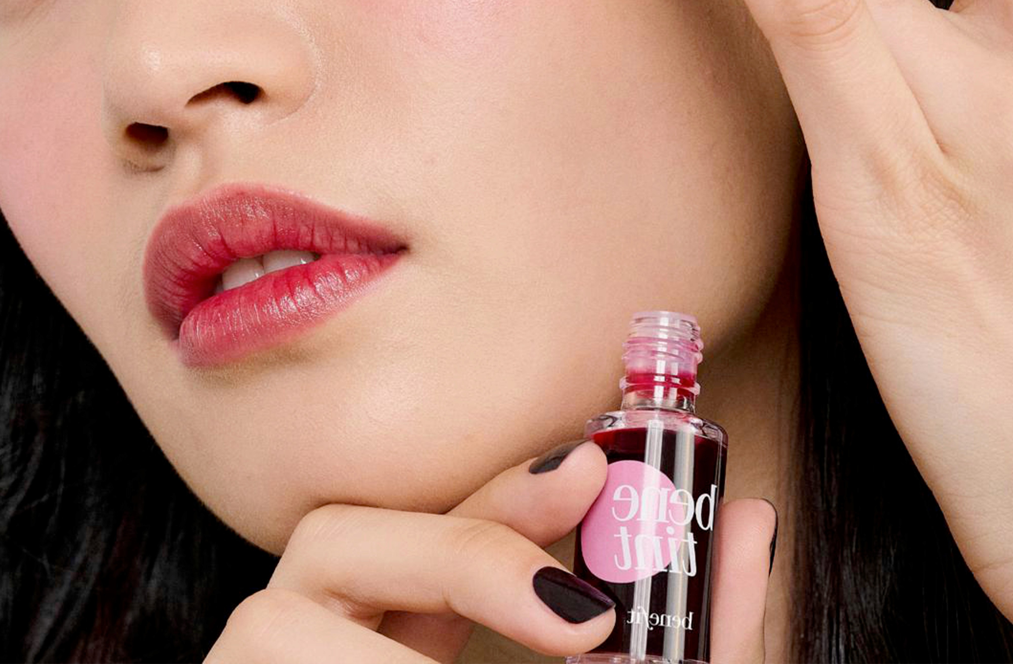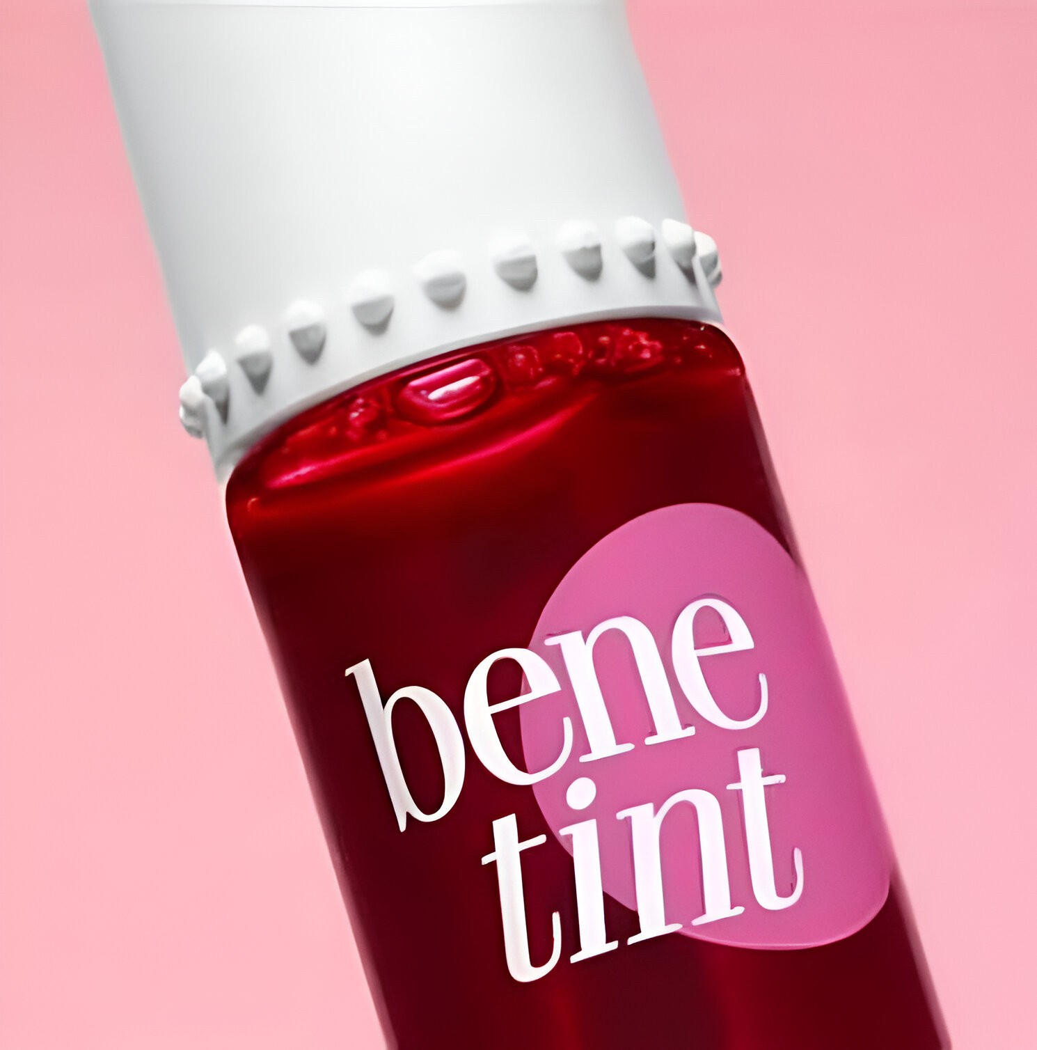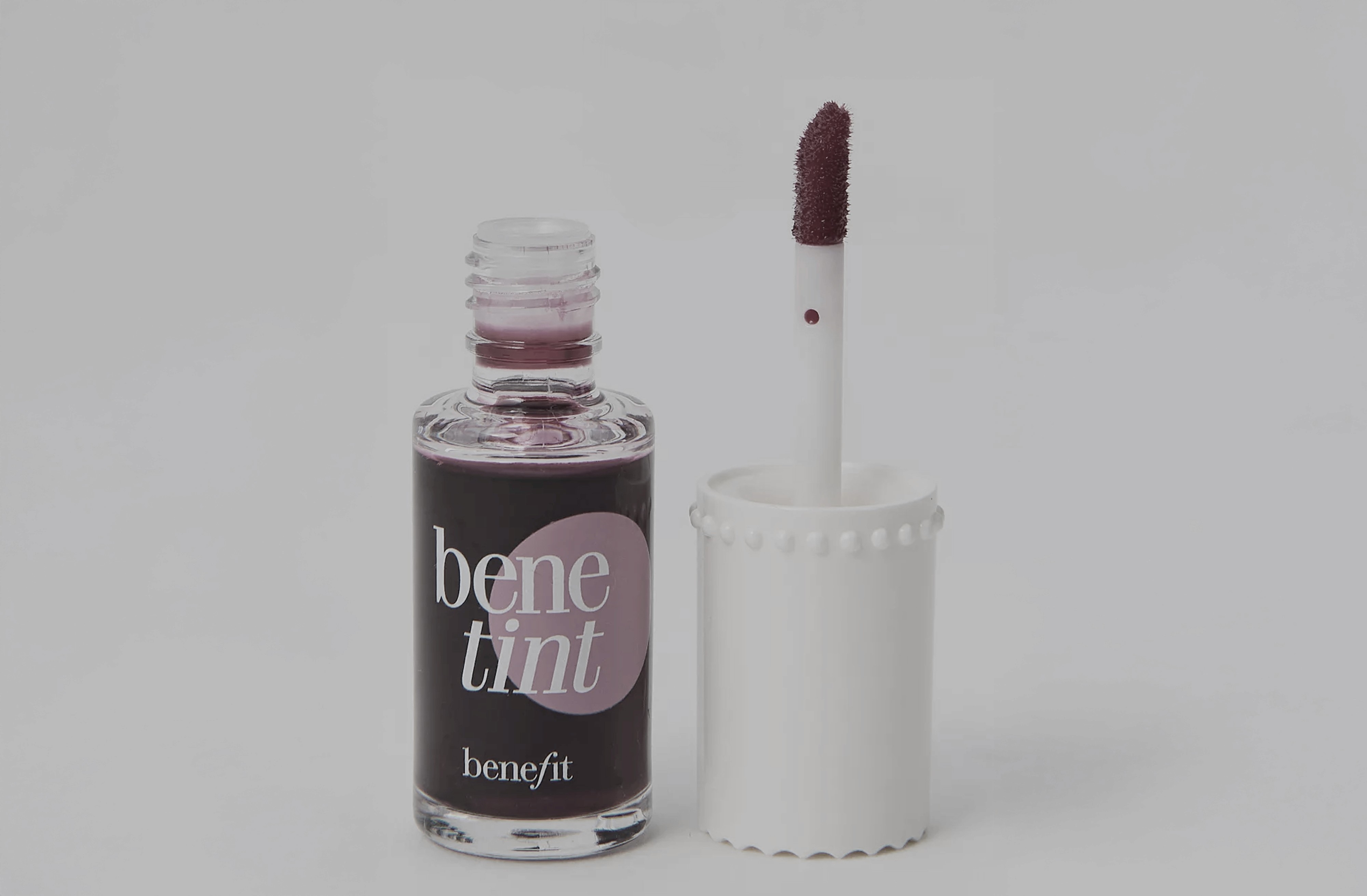
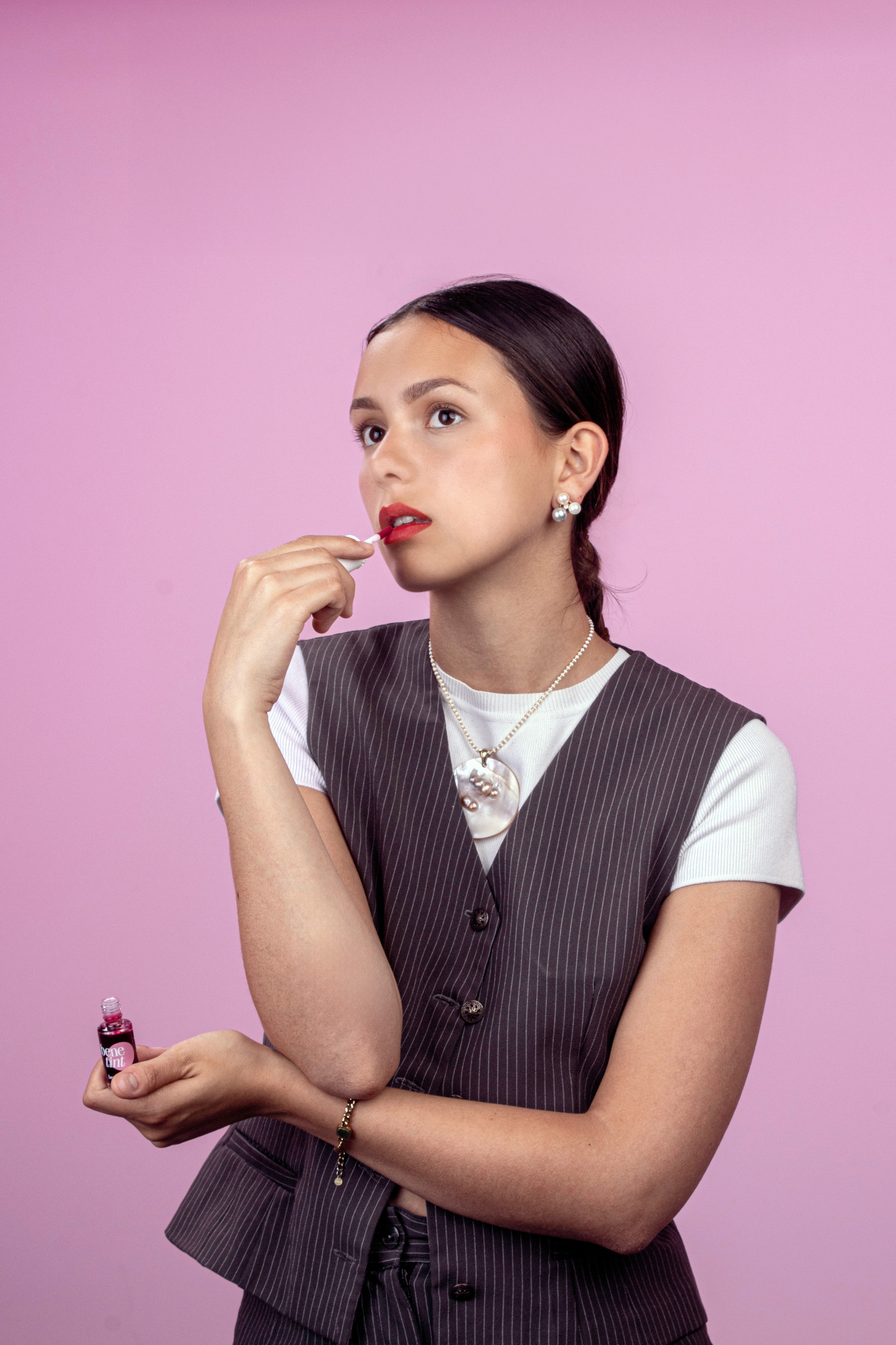
Where pink becomes a statement
This shoot was designed to translate Benefit’s playful spirit into a sharp, minimal aesthetic, he color palette soft pinks, luminous skin, and a vivid tint creates contrast without chaos, every visual element was selected to feel fresh, editorial, and unmistakably on-brand.
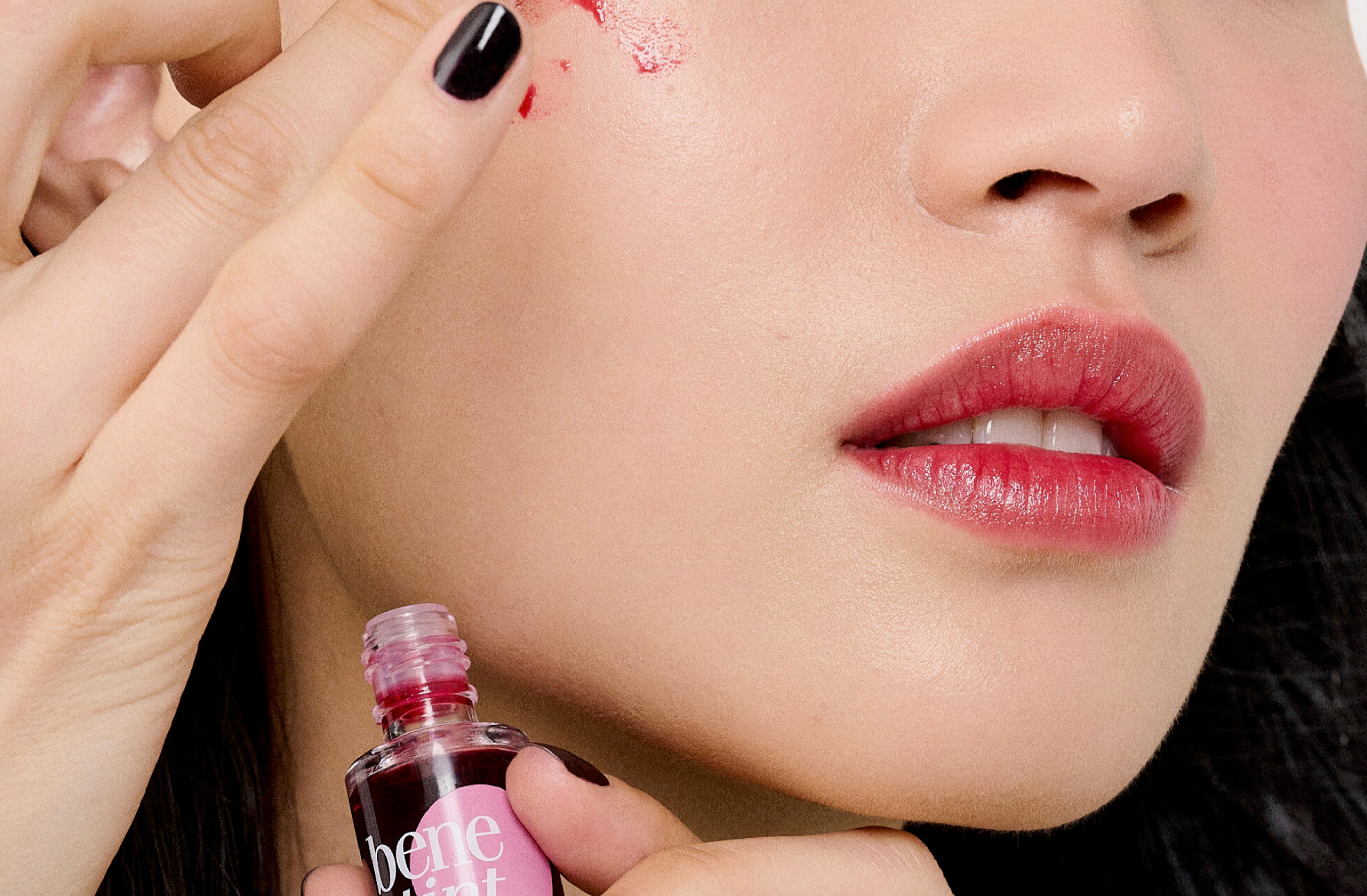
This is where I pushed my camera language
Using controlled studio lighting and close framing, I explored how to highlight emotion and product at once, from expression to texture, I focused on balance clean composition with beauty-driven storytelling, and these are not just portraits, they’re frames with intent.